In the world of UX design, accessibility is critical. It’s not only about creating engaging experiences, but also about making sure everyone can enjoy and use our products effectively. From contrast to visual hierarchy, every detail matters to ensure that our creations are inclusive and useful for all users. Here are five essential tips every designer should know:
- Use the Right Contrast
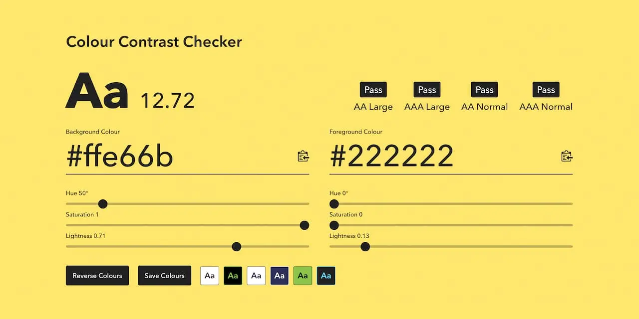
Proper contrast between background and text is crucial to ensure that our content is legible to all users, especially those with impaired vision. According to the World Health Organization, approximately 2.2 billion people in the world experience vision problems. It is therefore essential to use online tools, such as Contrast Checker, to check and adjust the contrast of our designs, ensuring a better experience for everyone.
- Don’t rely on Color alone for Feedback
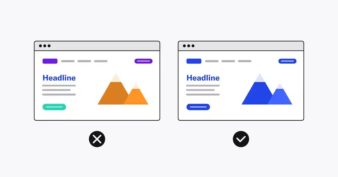
It is important to remember that not all users perceive colors in the same way. Color blindness affects a significant percentage of the population, limiting their ability to distinguish certain colors. Therefore, it is essential not to use color alone as a means of communication or feedback in our designs. We must complement it with other visual or textual elements to ensure that the information is clear and understandable to all users.
Here are some color combinations that can be avoided:
- Green/red
- Green/blue
- Green/black
- Green/brown
- Green/gray
- Light green/yellow
- Blue/purple
- Blue/grey
- Visual Hierarchy in Sizes and Spacing
A proper visual hierarchy facilitates understanding and navigation within a web page or application. Using different text sizes, spacing and formatting styles helps to highlight important information and organize content clearly and coherently. This allows users to easily identify which content is related and which is most relevant to their needs.
- A11y: Promoting Digital Accessibility
The a11y project, driven by the community of developers and designers, focuses on promoting the creation of digital products that are accessible to all. It provides a comprehensive checklist that allows us to evaluate the accessibility of our designs and ensure that we meet the standards necessary to effectively reach all users.
- WCAG: Web Content Accessibility Guidelines
The Web Content Accessibility Guidelines (WCAG) set clear standards to ensure that our digital products are accessible to all users. With compliance levels ranging from A (minimum) to AAA (high), these guidelines help us ensure that our designs meet the necessary accessibility standards. Level AA is considered standard, which ensures a medium level of accessibility for our users.
In short, designing for accessibility is critical to creating inclusive and useful digital experiences for all users. From contrast to visual hierarchy, every detail matters and helps ensure that our products are accessible to a wide range of users. By following these five tips and using the right tools and guidelines, we can ensure that our designs are accessible, inclusive and useful for everyone.
Bibliography
- Accessible Contrasts – the readability of visual information. (2022, June 14). NR. https://nr.no/en/projects/accessible-contrasts/
- How the WCAG color contrast checker can improve your website? (2023, April 30). Accessibility Spark. https://accessibilityspark.com/color-contrast-checker/
- How to design for color blindness. (n.d.). AudioEye. Retrieved June 7, 2024, from https://www.audioeye.com/post/8-ways-to-design-a-color-blind-friendly-website/
- Llasera, J. P. (2023, March 22). Jerarquía visual: qué es y cómo aplicarla bien. Imborrable. https://imborrable.com/blog/jerarquia-visual/
- Visser, C. (2023, September 19). Color Blind Accessibility: Web design for color blindness. Accessibility Checker. https://www.accessibilitychecker.org/blog/color-blind-accessibility/
- (N.d.). Scalahed.com. Retrieved June 7, 2024, from https://repositorio.scalahed.com/recursos/files/r171r/w30848w/Tipografia_Ant_B3_C.pdf